Let’s face it, the content we produce reflects our skills, attention to detail, and creativity. Ever notice the difference between a cheap and quickly assembled piece of content and something that takes more time and investment? You could put the same words on two pages side by side, but with different formatting and structure, one can appear much more interesting than the other.
The differences between low and high-effort content are glaring. Where the first piece of content lacks, the second piece excels. The ability to grab and hold the reader’s attention is of the utmost importance. After all, what good is content without the readers’ attention? Without our readers, we have no content in the first place.
On top of spending the correct amount of time and putting in the correct amount of effort, we must share our content in easily digestible formats. The reader should not strain in order to comprehend the ideas that the writer is trying to convey. If digesting your piece of content feels effortless, the reader will have a very enjoyable time and probably understand your concepts and ideas very well. If the reader needs to work in order to get the point, they probably aren’t getting it.
With all that said, let's take a look at one of the most popular tools for delivering content, Confluence, and see how it can help you keep your reader’s attention with great structure and formatting.
Build it in Confluence
If your team uses Confluence already for documentation or other content purposes, you are on the right track. Confluence is a team’s home for requirements gathering or knowledge base building. Teams can put all their thoughts and ideas down on “paper” in Confluence and then develop those concepts into actual product requirements. While a product team could write user stories in Confluence, your IT or support team could be building out their knowledge base to deflect tickets and promote self-service.
Confluence has use cases galore. We’ve written about many of these on our site. What is the best way to share content in Confluence Cloud, though? Is there any sort of guidelines for best practices? Well, we can at least start with a structure.
Structure in Confluence
Confluence allows you to set your page up well with a couple of different useful elements. These elements will set the tone for your page and direct the reader’s eyes while they comprehend the content you have put forward.
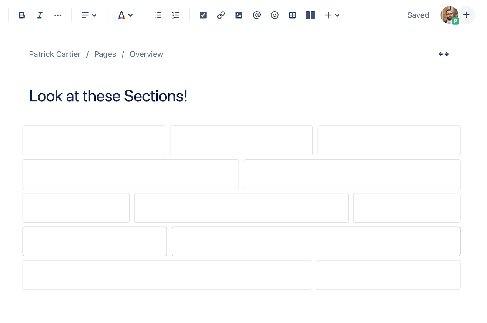
The first important element of a Confluence page is the sections. Confluence comes out of the box with a number of page section layouts.
These sections are robust enough to get the framework for your content set.
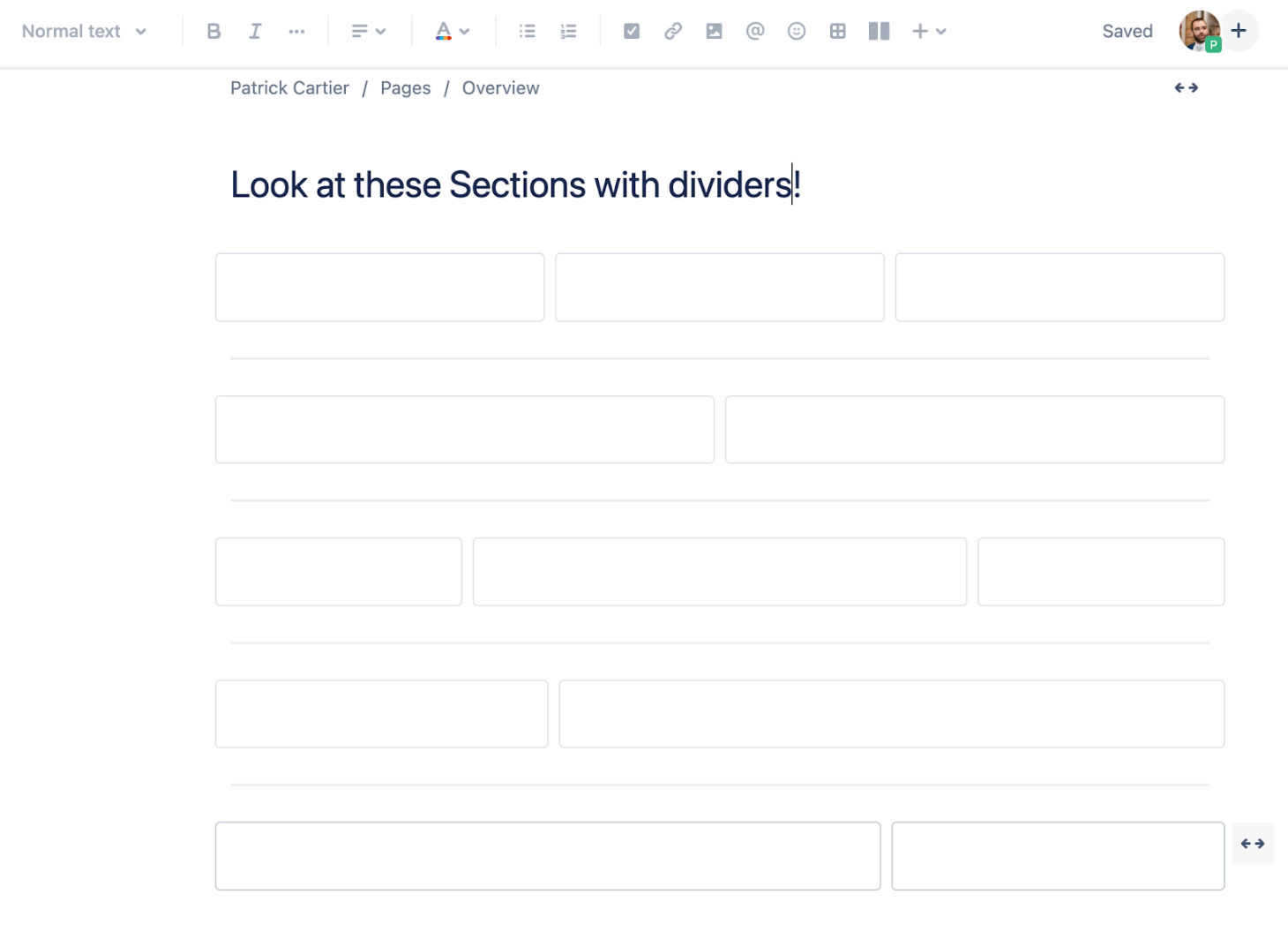
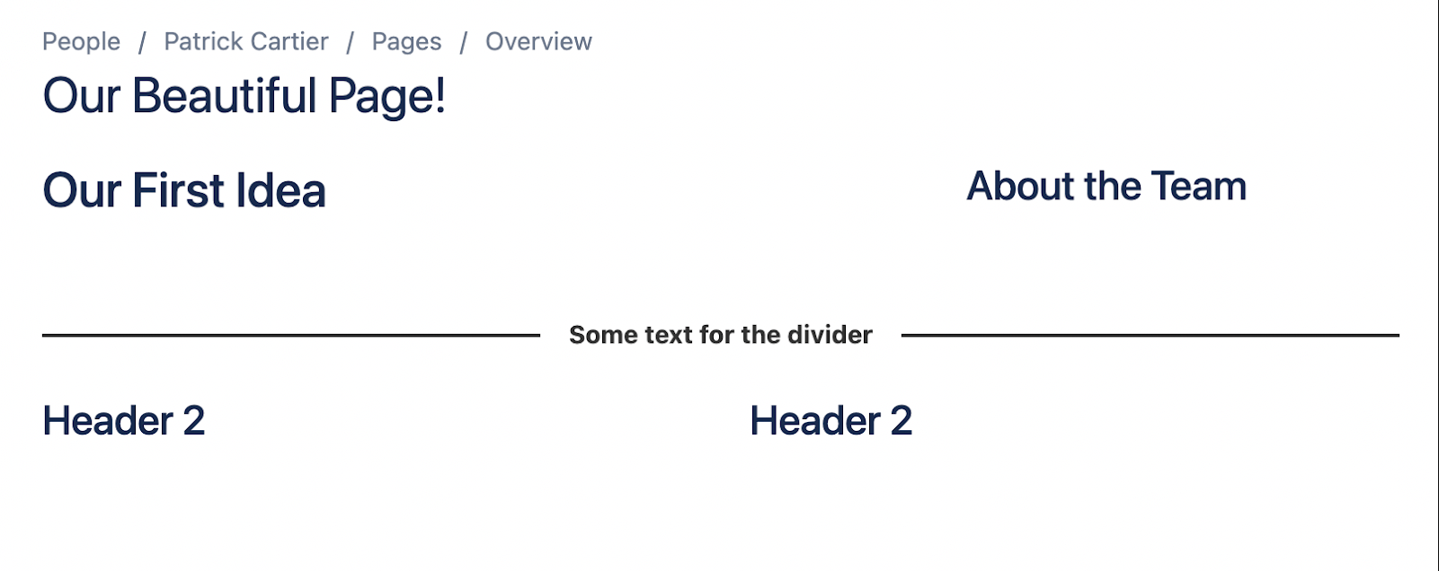
Once you have your sections set, you could consider using dividers in order to break these sections up horizontally. If you want the reader to distinguish between different sections, then dividers are useful in conveying the change of structure. Confluence comes with a useful Divider Macro to divide your pages.
As you can see from the above screenshot, a divider comes in handy when we want to give the reader a visual indicator of a break between sections.
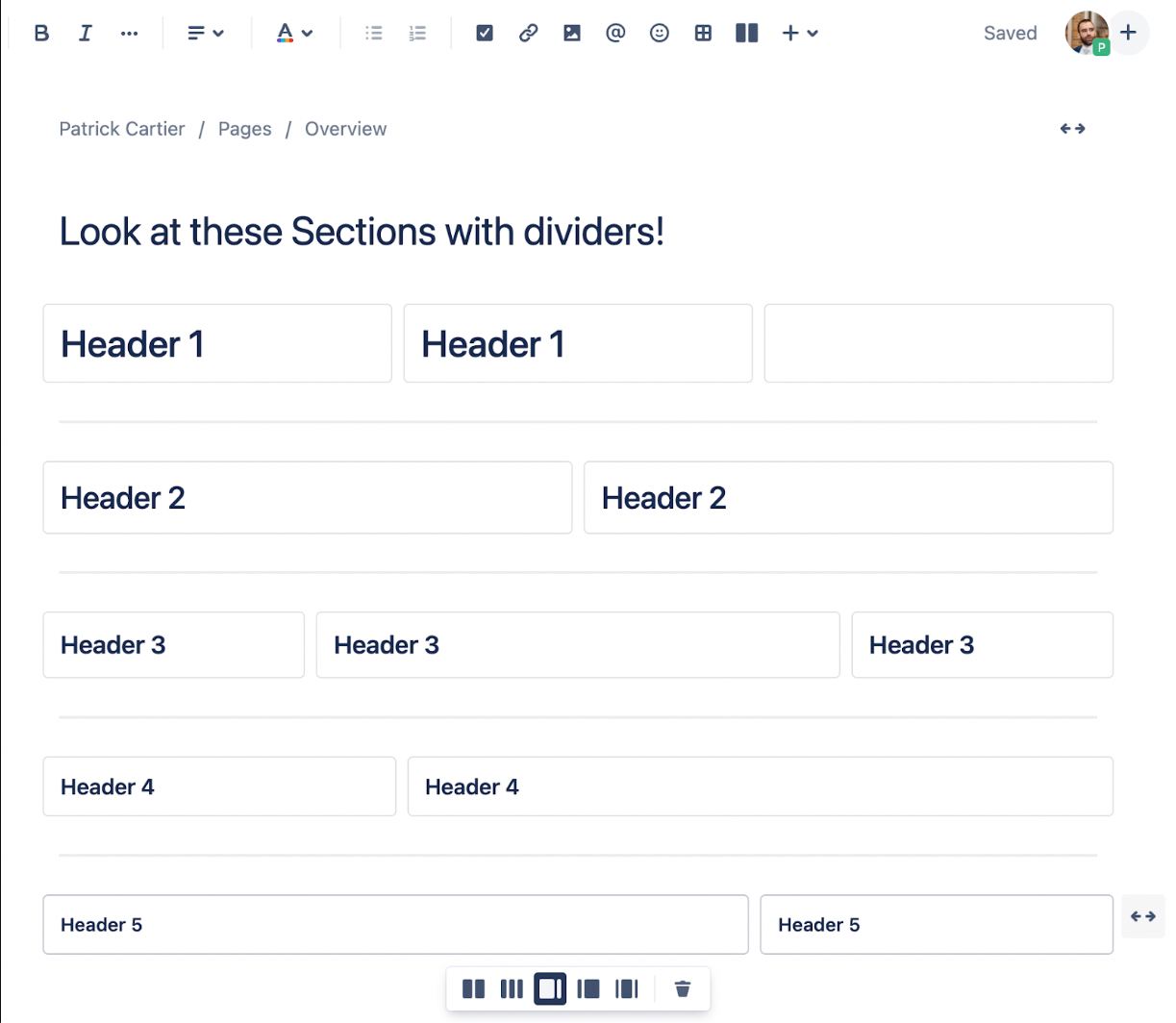
Finally, we can give our pages a distinguishable layout with headers. Confluence comes ready out of the box with a number of different headers which make the font either bigger or bolder, or sometimes both!
Headers work well at the top of sections and when we are trying to distinguish between two different parts within a section.
So how do we make these pages stickier? Meaning, how do we get our readers to stay interested in the topic and comprehend the information contained on the page?
Beautify it with Aura
Aura Content formatting Macros allow you to take the great structure that Confluence provides and make it beautiful. Aura is a suite of formatting macros that allow you to change the look and feel of your content on your Confluence page. The app comes with thirteen macros, all offering different formatting aspects to your Confluence page. The macros are
- Background Content
- Button
- Cards
- Countdown
- Divider
- Embed
- HTML
- Panel
- Progress
- Status
- Title
- Tabs
- User Profiles
All of these Macros can help make your page more interesting and engaging for your readers. For the sake of this post, let’s focus on the Divider, Background, and Cards Macros.
Divider
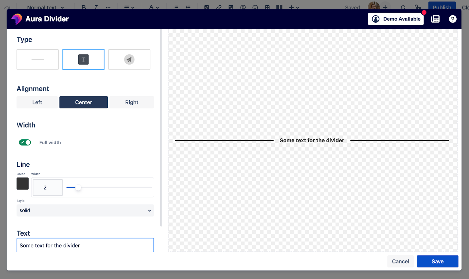
With the Aura Divider Macro, users can insert a different divider than is available in the standard Confluence editor. The easy and intuitive configuration editor allows even inexperienced Confluence users to quickly set up the divider and structure their pages.
As you can see from the above screenshot you can choose the divider type (line, line with icon, and line with text), as well as the alignment, width, and color of the divider.
Let’s take a look at what the divider could look like depending on how you customize it.
Background
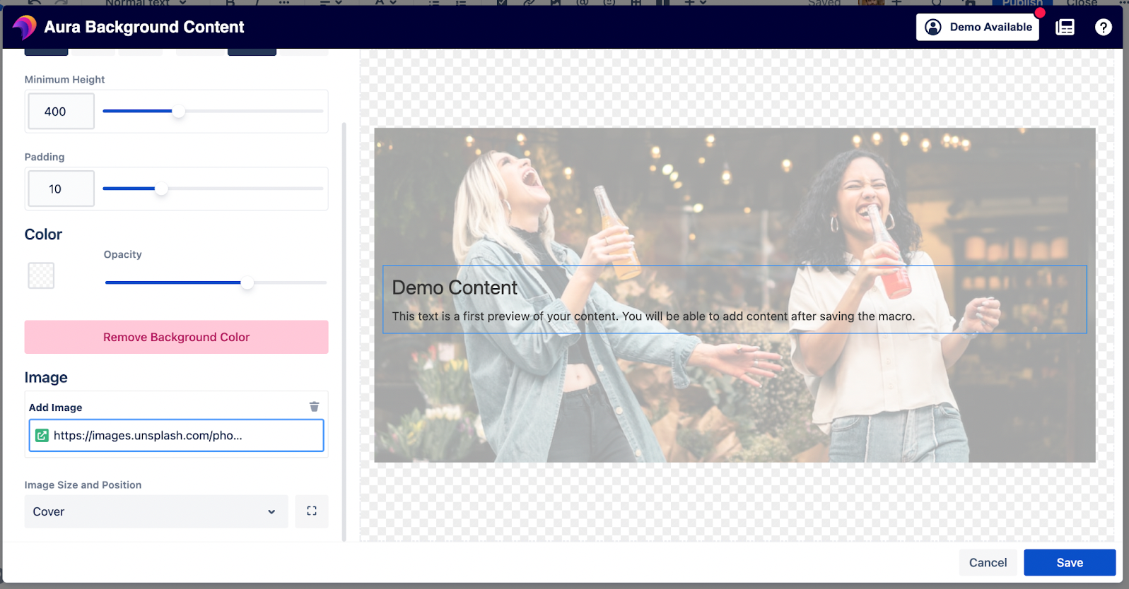
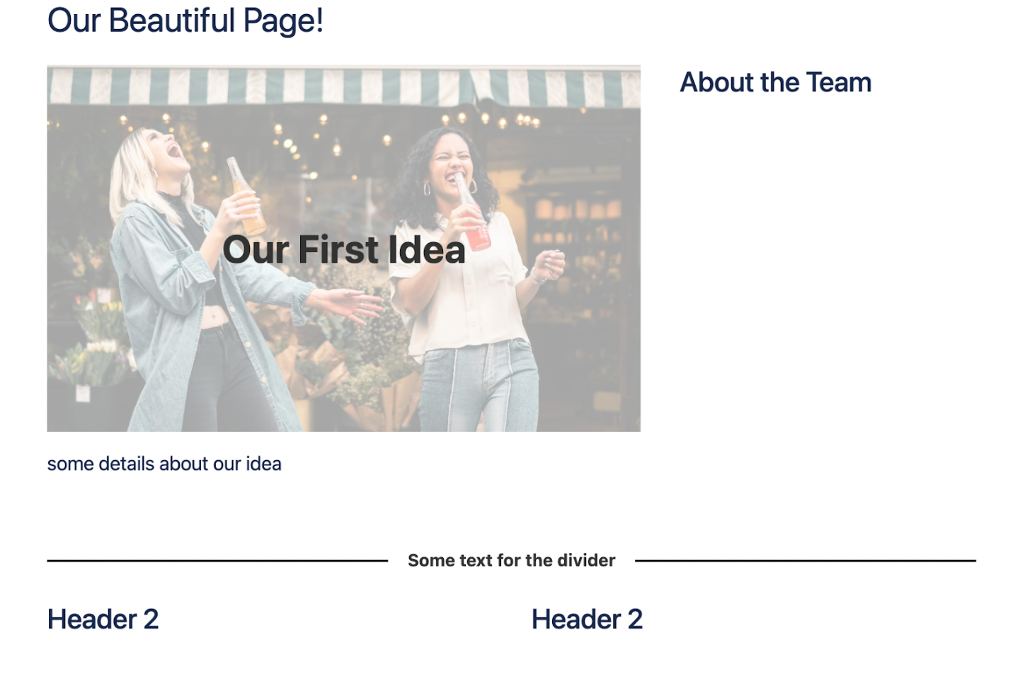
The Aura background macro allows you to insert a background image, color, or both to bring your page to life. The great thing about the Aura background macro is it allows you to embed other macros within it. This is great when you want to bring a title or heading to life. You can do so by simply inserting the Aura Title Macro inside the Aura background macro.
Let’s take a look at some of the settings.
With the Aura Background macro easy and intuitive configurator, you can choose the content position, height, padding, color and/or image of the background. With these different settings, you can easily adapt different background macros to give your headings a distinguished look.
Cards
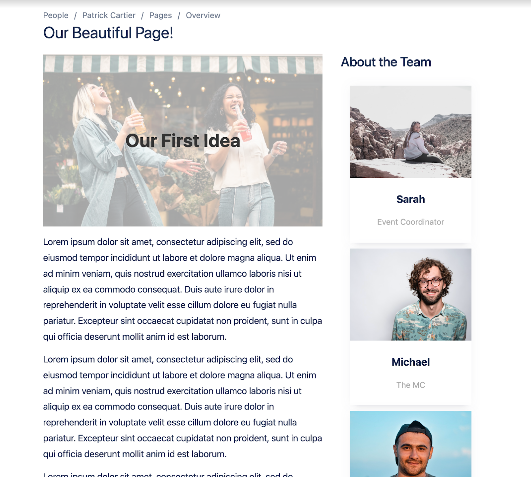
Finally we have Aura cards. Aura cards allow you to create up to six content boxes organized vertically or horizontally. These content boxes allow you to present your information in an easily digestible, attractive, and organized way.
In the easy and intuitive editor, the Aura Cards content can be set. You can have a title and then additional content. You can then choose a color, add an image or icon, and insert a link.
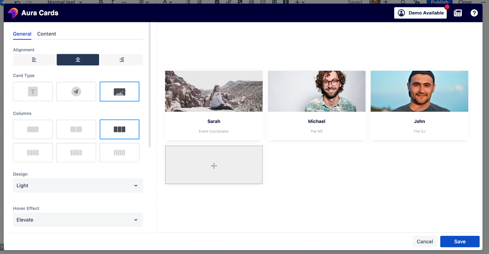
In the general tab you can choose the alignment, card type, columns, design, hover effect, margin, padding, and full width of the parent. These are all general settings that will apply to each card within your Aura Cards macro.
The last tab of the Aura Cards macro is the live preview tab. This allows you to take a look at what you have created before publishing. This is a useful feature for both new and experienced users.
And the best part about Aura Cards? We can create templates for easily standardized content.
Aura + Confluence = Engaging Content
It really is that simple. If you and your team are already using Confluence, a great compliment to the standard Confluence structure is Aura Content formatting macros. You can expand up on the already functional structure Confluence provides and enrich your content with additional macros.
If you need any help purchasing Aura Content Formatting Macros for Confluence or if you have any questions, please feel free to reach out to us at Seibert Media. We would be happy to help.
Further Reading
- Build Beautiful Confluence Pages With Just a Few Clicks
- Aura – How To Build a Stunning Landing Page with Confluence Cloud
- How To Create an Engaging Team Page in Confluence with Aura
- How to Create Beautiful Pages in Seconds with Aura Templates for Confluence Cloud
- Organize Content in Confluence with Aura Tabs
- Highlight Content in Confluence with Aura Panels
