You’ve heard it or a variation of it a million times: “Put it in Confluence.” “Make a Confluence page for it.” “Why not document that in Confluence?”
Confluence is an amazing documentation tool for anything related to your organization. If you have new members joining your team, they can write a quick post about themselves so people get to know them. If you have clients who want to build something with your team, you can document their requirements right in Confluence and tie those to the issues you work on in Jira. If you have a help desk in Jira Service Management, you can integrate Confluence to deflect common tickets with knowledge base articles.
Confluence is all-encompassing when it comes to documentation. Out-of-the-box you can document just about anything. Confluence even comes with close to 100 blueprints to get your team up and running fast.
In the rest of this post, we will explore one particular use case of Confluence, which is creating a team Space.
How teams and departments organize themselves in Confluence Cloud
Organization in Confluence relies on Spaces and Pages.
Pages are fairly self-explanatory, they are the living sections in each Space where your content thrives. Pages can be notes, blogs, how-to articles, or just about any piece of content we can think of. Users can place text, macros, videos, images, and even gifs on pages. There are a ton of macros that come with Confluence, so be sure to check them out to make your page more engaging.
Think of Spaces like folders. This is where all of your pages are held. If you are familiar with Google Docs, a Space is like a folder in your Google Drive. The main difference and benefit of Spaces is that you can organize your pages in a hierarchy. Meaning that within a Space, you could have a page with many pages embedded underneath that “Parent Page”.
Teams and departments generally should organize themselves into Spaces in Confluence. Then, if they need to access any documents related to their team or department, they would know the exact Space to look. From there, teams could organize their content into different Page Trees based on their needs.
Why it’s so important to make spaces look beautiful
Out-of-the-box, Confluence is a very functional tool. It allows you to create pages with the content we mentioned above. You can adjust the layouts of pages to show columns and add headings to different sections. However, and this is a critique from our experience working in Confluence and helping many customers with the tool, the pages are not the most engaging-looking wiki pages around. They could always use a little more decoration and beauty.
Some people might argue that wiki pages don’t need beauty, they should just be functional pieces of information for users to reference when they need it. While we agree that the functional part of Confluence is important, it can be detrimental to overlook the beauty portion of pages. Readers and editors alike will have more incentive to work with something that is appealing and engaging rather than plain text on a white background.
This was our inspiration for Aura - Beautiful Formatting Macros and why we contend that Pages and Spaces in Confluence should look beautiful. Beauty keeps readers interested and returning to your Spaces and Pages. There is greater appeal to creating something beautiful and functional compared with creating something just functional. For this reason, page creators and editors should also make their pages beautiful and if they choose to do so, do it with Aura.
How to take it to the next level with Aura
Aura - Beautiful Formatting Macros is an app for Confluence Cloud, Server, and Data Center. The app comes with the following macros:
- Status: Add a customizable and predefined status label
- Divider: Separate content with a customizable horizontal line
- Cards: Beautiful cards you can link to the content of your choice
- Countdown: Add a countdown clock to your page
- Title: Add a beautiful headline to get the reader’s attention
- Tabs: Create tabs to structure your content
- Panel: Highlight information in a customizable panel
- Progress: Indicate the progress of a project or task
- Button: Customizable, engaging buttons linking to your content
- Background Color: Use images and colors as a background for your content
In our context for today, presenting your team, we’ll focus on Aura Titles, Backgrounds, Buttons, and Dividers.
Titles
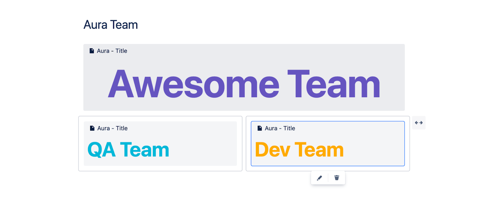
Aura Titles allow you to create beautiful and customizable titles that grab the reader’s attention. The parameters of the macro allow you to adjust the font weight and size, text alignment, and color. You can also choose to adjust the line height manually.
How do Aura Titles help create a page that present your team? While you could use Aura Titles to present the team name itself at the top of a page:
You could also use the Aura Title macro to present different groups within your team:
Finally, you could use the Aura Title macro to organize multiple teams on one page.
Backgrounds
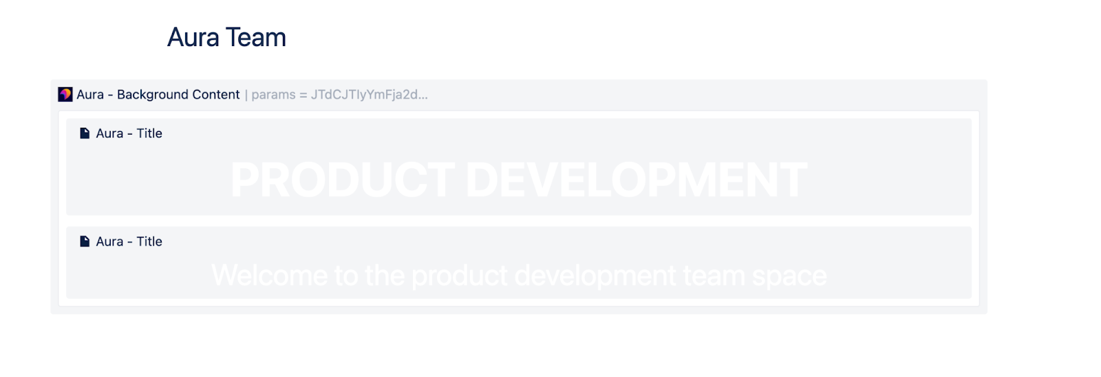
Backgrounds come in handy on many different types of pages, but the best place for an Aura Background macro on a team page is for the actual user or team you are presenting. For the Aura Background macro, we can choose where the content in the macro is positioned, the minimum height of the background, and the padding. From there, we can choose whether to have an image and/or a solid color as background. We can also set the image size and position, choosing from cover, curtain, or auto. Let’s take a look at our team example with the background and title macro’s combined:
Think about the possibilities and how nice it would be to see a big picture of the team. This helps the users recognize that person in the office who they didn’t know before.
Buttons
Aura Button macros are also useful on a variety of page types. Putting a button on a page just requires some text and the link that the button should go to. You can also set a background color or image for the button. In our context of presenting your team, it makes sense to add a few buttons that link to other items relating to the team. It’s up to you where the buttons go.
In this example, we sent readers to a page where they can contact the team, a lower section on the page describing more about the team, and the team’s Jira Service Management portal.
Dividers
Aura Dividers are useful when you need to break sections of a page up horizontally. You can choose to just have a plain line, some text with your line, or even an icon in the line. Then you can choose where the text or icon goes in the line. You can also adjust the line size and color. Finally, you can choose from solid, dashed, dotted, or double solid line types. Let’s look at an example with our team.
As you can see, the Aura Divider macro is a great way to divide sections of a page, to bring more clarity to each section.
Make your team pages beautiful
In our example today, we talked about how the Aura Title, Background, Button, and Divider macros can make your team pages look beautiful and add functionality. We only touched upon four of the ten macros that come with Aura, so if you are just considering the app after reading this, please check out all the other macros available with Aura.
If you have any questions or suggestions about Aura, please feel free to reach out to us at Seibert Media.
Further Reading
- How to Easily Make Your Events Stand Out In Confluence With Aura
- Aura – How To Build a Stunning Landing Page with Confluence Cloud
- Highlight Content in Confluence with Aura Panels
- Titles, Buttons & Divider in Confluence with Aura
- Organize Content in Confluence with Aura Tabs
- Build A Help Center in Confluence with Aura
